| Examples: > Usability Evaluation Prototype Testing |
Usability Evaluations
There are several types and methods used for User Interface Evaluations. A simple heuristic evaluation is shown below as an example of what to expect. However, when evaluating several similar sites or comparing a customer site to competive sites, a table format with numbered ratings would be used rather than this report style. Heuristic Evaluation of the v2.1 Interface (continued below) |
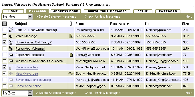
Icons for phone messages, pager messages, palm pilot messages, ...etc should also be recognized and included under the "New" column heading in the Inbox. That will make it seem like it's bigger than a simple mail program.
There are two different setup areas. One area is for setting up External Mail and another is for setting up Wireless Options. Why isn't there just one main Setup area for these things? The result is that the Filtering of messages is pushed a level down. A major selling point of this Message Center should be that you can easily Direct and Filter all your messages and communications. Currently, that functionality is buried.
Who is the target audience for this product? We need to synthisize the user base down and come up with a two or three user names/personalities to which to design. This is an effective approach used to clarify communication and to reduce personal design conflicts. (It removes us as direct users and projects our needs or concerns onto our 'invented' users.)
Individual Screen Reviews
"Sign Me Up" screen:
The green tiger stripes are not working. They tend to move your eye off the screen instead of leading you to a task. There is not a strong grouping of task sets either. The screen is choppy and does not read well as a cohesive environment. The diagnal line that makes the toolbar buttons bigger (moving left to right) might also make some people think the bigger buttons are more important. However, that is not the case. An interesting design is obviously a good goal to strive for, but not at the expense of usability.
When you click on one of the main headings at the top of the screen, a heading appears at the top of the frame. However, when you scroll the page down a little, you loose that heading so it's no longer apparent where you are at. The buttons or tabs at the top need to change in order make it more apparent to the user which task heading they are within.
Home:
When a user has registered for the first time and they are presented with the Home screen, the information about the Privacy Policy should be prominently displayed. After the initial registration, it can just be a link at the bottom of the screen (like it is now).
Displaying the Capacity as a percentage is something on which we'll need to collect feedback. It may prove to be confusing for many users. Another approach would be to state the Total Disk Space, then the Total Disk Space Used. Or, you could just not show it unless it becomes a problem. Is it really something that's required? If the majority of users never exceed the limit then it's techie system data that wastes display space on the screen. If storage becomes a problem, we simply let the users know they need to cleanout their Message box, otherwise, don't bother them with techie details and the internal limitations of the system.
Mail:
In general, the presentation is ok.
Frames are being used. One drawback here is that the cursor has to be within the email list in order to use the Pageup/down keys.
The color-coding scheme requires the user to remember which color they associated with which message or mail server type. This is something that will be hard to test in our initial testing because people will think it's a good idea at first. Once they use the system for awhile (or if they only use it once in a while) they may have trouble remembering their color code.
Column Sorting - I'm not sure how it's going to be implemented, but the user should be able to click on either the Sort Arrow or the Column heading in order to sort the column. Will you be able to sort the color-coded column as well?
Write Mail:
I'll be curious to know if the Address book will be presented with a different button (rather than "Write Email") if the user got to the Address book through the "To" button in Write Mail. The button should be an "OK" button instead.
External Mail:
External Mail Filtering List - Setting up Filters is going to overwhelm and turn off many users. Along with filtering, there needs to be a simpler approach included to "Direct My Message". A forwarding mechanism to send eMails to pagers or vice versa (among other things) would be more useful to more people. It would also be simpler to design and easier functionality for the users to grasp.
External Mail Filtering List - The method used to Delete filters is not the same as the method used to delete messages. They should use the same mechanism. Don't make the user learn a new way to do the same operation within the same program.
There are some options next to the External Mail Settings box that allow the user to go to "my wireless home" (which is Home), contacts (which is the Address Book), Local Information (no link yet), Hospitality (I guess this is a carry over from eStore), Personal Information, and Log Out. A couple of these options simply replace the External Mail Settings box with a new box of Settings, but other options go to a different screen (You lose all the Option choices when this happens). This may be a temporary situation, but I'd like to know so that it can be addressed.
Personal Info:
I don't think this will be welcomed by users. It feels like the service is collecting information about them (the customer) rather than providing a convenience. You can gather just as much info if this were positioned as the area where you create a "Signature" for messages instead. However, the Signature should be a subheading under Messages (Mail) rather than a seperate heading. The Personal Info heading should be changed to Password.
This screen shows suggested changes to the messaging application reviewed in the evaluation above.
|
|
contact: terry@terrybrown.comphone: (707) 486-3476
![]()